
THE COFFEE SHOP
CASE STUDY

PRODUCT OVERVIEW
The product:
The Coffee Shop is a café across the United States serving not only coffee, but teas, snacks and breakfast sandwiches as well. The Coffee Shop offers walk in pickup, drive-thru or curbside pickup. The Coffee Shop’s targets customers like commuters, students and workers who would like to conveniently order coffee and customize their order.
Product duration:
May 2021 – November 2021

The goal:
Design an app for The Coffee Shop that allows users to order and customize items plus choose different pickup options.
The problem:
Busy workers and students lack the time to make coffee and would like to choose from different pickup options when they order coffee.
Responsibilities:
Conducting interviews, paper and digital wireframing, low and high-fidelity prototyping, conducting usability studies, accounting for accessibility, and iterating on designs
My role:
UI/UX designer, UX researcher from concept to delivery
UNDERSTANDING THE USER
User research
Personas
Problem statements
User journey maps
User research: summary
I conducted interviews and created empathy maps to understand the users I’m designing for and their needs. A primary user group identified through research was students and working adults would would like a convenient way to order coffee.
This user group confirmed initial assumptions about The Coffee Shop customers, but research also revealed that convenience and customization of beverages and snacks/breakfast sandwiches plus pickup options are vital to the user’s needs in usage of the app.
User research: pain points
TIME
Especially in the morning and during lunch, users don’t have enough time to make their own coffee or tea
CONVENIENCE
Users always want a quick and efficient way of picking up and order
APP USAGE
With the amount of times per week a user might order a coffee, they would like ways of saving their order, receiving rewards and saving payment methods
CUSTOMIZATION
Because some users might have dietary restrictions, users would like ways of customizing their order

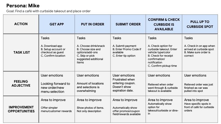
Persona: Mike
Problem statement: Mike is an engineer who has accessibility concerns. He likes to find cafes where he can reserve a table and place his order.
User journey map
Mapping Mike’s journey revealed how helpful it would be to have curbside takeout for cafés that aren’t easily wheelchair accessible.
STARTING THE DESIGN
Paper wireframes
Digital wireframes
Low-fidelity prototype
Usability studies
PAPER WIREFRAMES
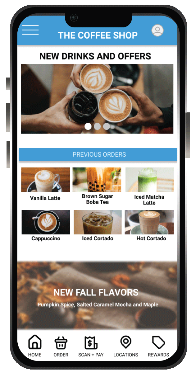
Taking the time to draft iterations of each screen of the app on paper ensured that the elements that made it to digital wireframes would be well-suited to address user pain points. For the home screen, I highlighted new drink options and offers plus previous orders for quick access to help users save time.
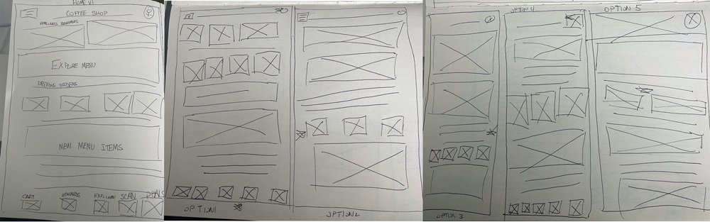
First image is of final paper wireframe with stars being used to mark the elements of each sketch that would be used in the initial digital wireframes.
- Hero images highlighting new drinks and offers
DIGITAL WIREFRAMES
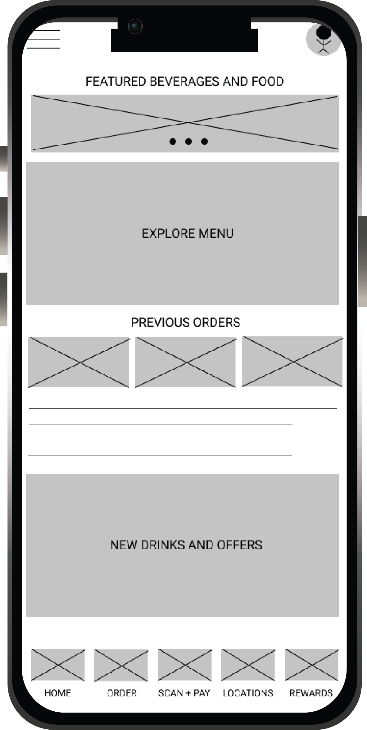
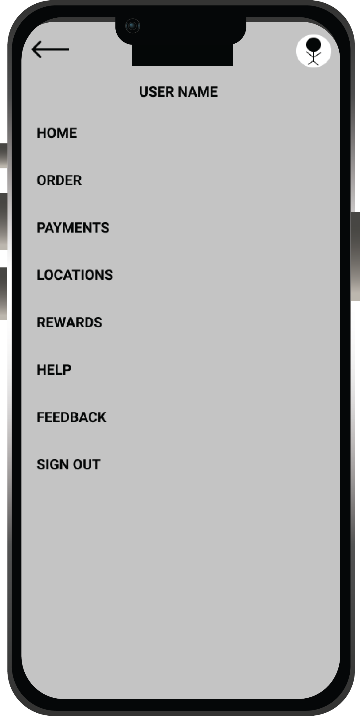
As the initial design phase continued, I made sure to base screen designs on feedback and findings from the user research that was conducted.
View of previous orders for quick access and convenience (right)
Access to profile page
(top right)
Navigation was important to the users to have easy access to a number of pages as well as having the use of assistive technology within the app
Easy access to navigation and back to previous page (right)
LOW-FIDELITY PROTOTYPE
Using the completed set of digital wireframes, I created a low-fidelity prototype. The primary user flow I connected was ordering and customizing a beverage order with pickup options.
Usability study: findings
Rounds 2 findings for The Coffee Shop:
I conducted 2 rounds of usability studies. Findings from the first study helped guide the design from wireframes to mockups. The second study used a high-fidelity prototype and revealed what aspects of the mockups need refining.
Round 2 Findings
It’s a bit difficult to find the Sign Up/Login Screen
It’s a little confusing if the user decides to add an additional item
Round 1 findings
Users want ‘Choose Location’ option before ordering
Users want ‘Choose Pickup’ option before ordering
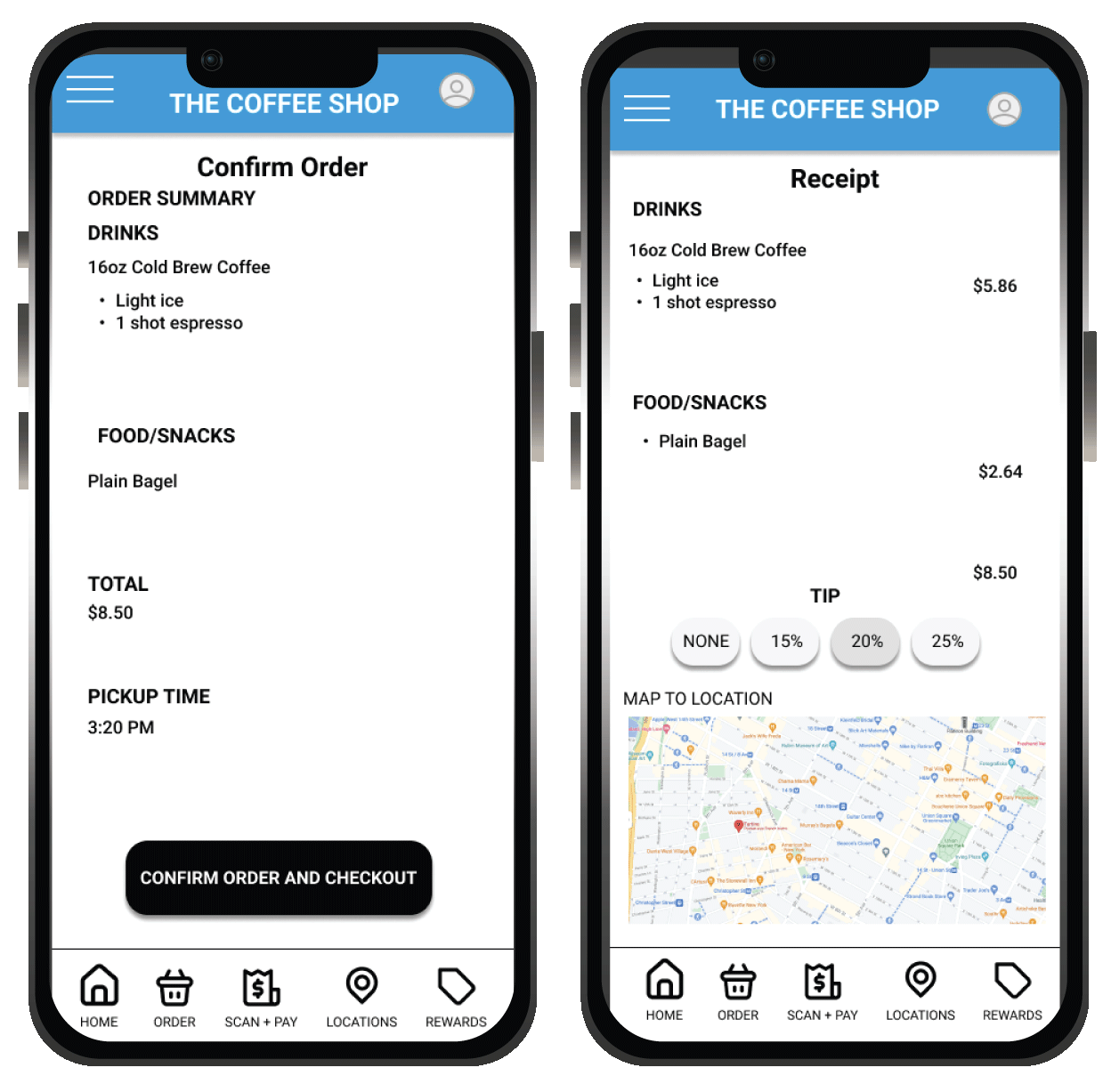
Users want ‘Confirm Order to be separate page from ‘Receipt’
Refining the design
Mockups
High-fidelity prototype
Accessibility
MOCKUPS
Early designs allowed for some customization, but after the usability studies, I updated the homepage since users mentioned it was too busy. I also revised the design so users can clearly see what options are selected.

Before usability study

After usability study
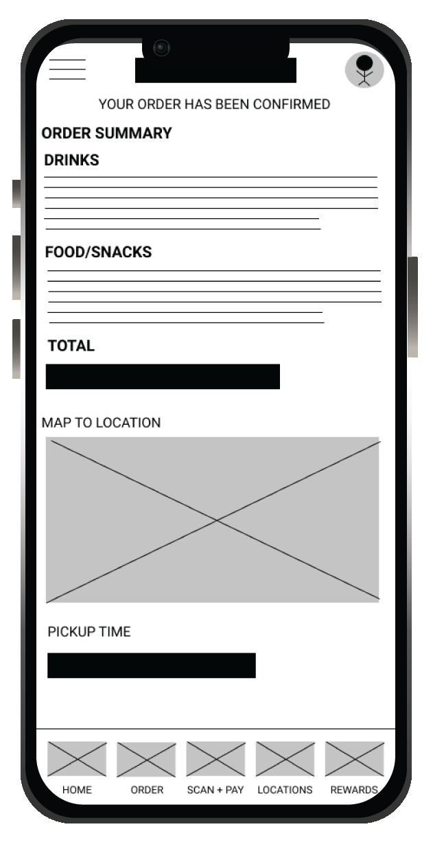
The second usability study revealed frustration with the ‘Confirmation’ and ‘Receipt’ page’. It previously was one combined page, but users were confused if their order went through since they didn’t see a receipt. Now the ‘Confirmation’ and ‘Receipt’ pages are separate.
Before usability study
After usability stidy
KEY MOCKUPS
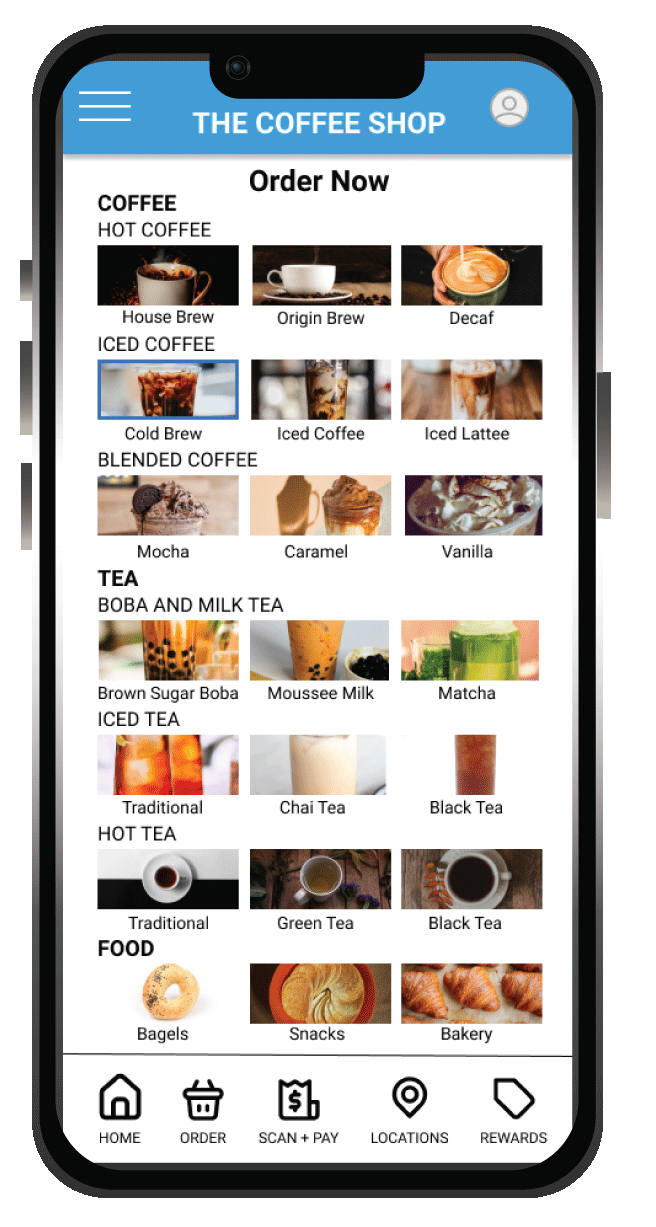


HIGH-FIDELITY PROTOTYPE
The final high-fidelity prototype presented cleaner user flows for ordering and customizing a beverage. It also met user needs for pickup and drive-thru options as well as added user flow for signing up and signing into a profile.

Accessibility considerations
Using graphics and icons for easy navigation
Adding alt text to images for users who are vision impaired through screen readers.
Added pickup options for users who may be physically impaired.
Takeaways
Next Steps
GOING FORWARD
TAKEAWAYS:
What I learned:
White designing The Coffee Shop app, I learned that even though you may think your idea, navigation or design is great, it’s important to receive that user feedback and incorporate it into your designs because there might be something you’ve never thought to add or edit into your prototype or mockups that makes it that much more great overall.
Impact:
The app is really helpful to users as far as not only customizing beverages, but their profile as well.
One quote from peer feedback:
”The app is now so easy to navigate as opposed to earlier usability studies.”
Next Steps
Conduct more user research to determine whether pain points have been addressed.
Look over and update copy within app to make it more user friendly and relatable to the user.
Conduct more user research to determine any new areas of need.
Let’s Connect!
Thank you for your time reviewing my work on the The Coffee Shop app! If you’d like to see more, view my work and case studies here, or to get in touch, visit the contact page or my LinkedIn!