
MOVIE PREMIERE CINEMAS
CASE STUDY
Project Overview
The product:
Movie Premiere Cinemas is a website for a high-end movie theater that lets you purchase tickets, reserve seats and has an option to order food before or during your movie.
Project duration:
5 weeks from November 2021 to December 2021

The goal:
Design Movie Premiere Cinemas website to be user friendly, have easy and clear navigation as well as a fast checkout process.
The problem:
Current movie theater sites are cluttered, confusing to navigate and have insufficient systems for browsing through movies and movie times
My role:
Lead UX/UI designer and UX researcher for Movie Premiere Cinemas website design
Responsibilities:
Conducting interviews, user research, wireframing, low and high-fidelity prototyping, conducting usability studies while accounting for accessibility, iterating on designs and responsive design.
Understanding the user
User research
Personas
Problem statements
User journey maps
User research: summary
I conducted user interviews, which i then turned into empathy maps to better understand the target users and their needs. What I discovered is that many users who purchase tickets on a website, do it for convenience and planning ahead so a certain movie won’t sell out by the time they get to the ticket window if they were to buy it in person. However, users who search and purchase movie tickets on a website or app, find the navigation confusing with too many steps, which causes the experience to be more inconvenient or frustrating.
User research: pain points
Navigation
Movie theater websites and movie ticket apps are often too busy or overwhelming, which results in confusing navigation
Purchasing Process
The process from selecting a movie to receiving a receipt and confirmation is too long sometimes resulting in users exiting the site or app
Experience
Movie Theater websites aren’t often engaging with too many popups for offers or discounts. Users want more movie details like cast, length of movie, etc.
Loading Times
Most movie theater websites have long loading times because of autoplay of previews or trailers, which can be frustrating
Persona: Isabel
Problem statement:
Isabel is a busy teacher who needs an easy way to find movies that she can see with her daughter at matinee times that fit her schedule.
User journey map
I created a user journey map of Isabel’s experience using the site to help find possible pain points and ideas on opportunity for improvement
STARTING THE DESIGN
Sitemap
Paper wireframes
Digital wireframes
Low-fidelity prototype
Usability studies
SITEMAP

Difficulty with website navigation and a confusing ticket order process was a primary paint point for users, so I used that feedback to create a sitemap.
My goal was to create thee most simple and user-friendly navigation without having a user get frustrated throughout the ticket purchasing process.
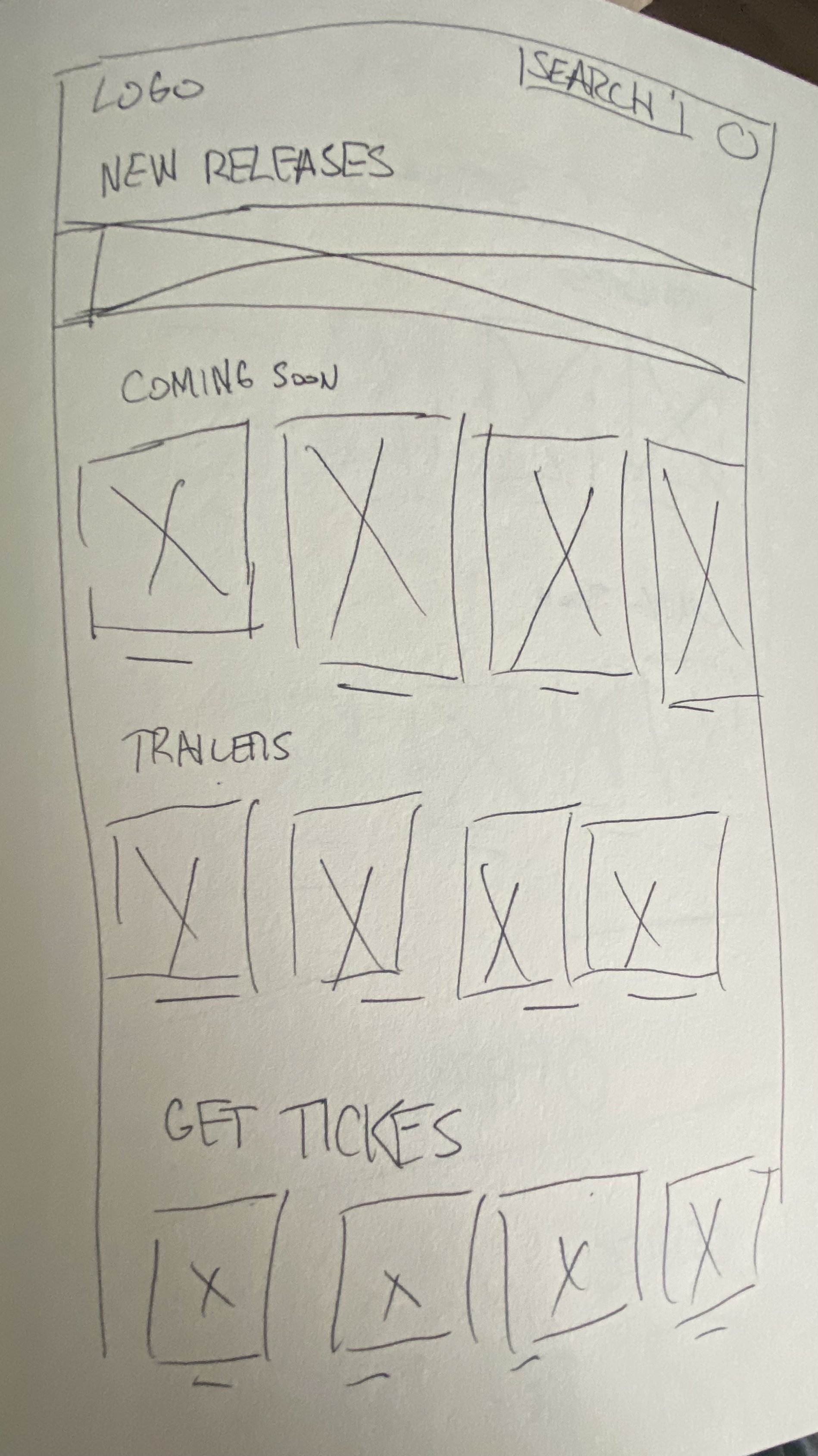
PAPER WIREFRAMES
Next I sketched out paper wireframes for each screen of the site keeping in mind user pain points including navigation, purchasing tickets and browsing movies.
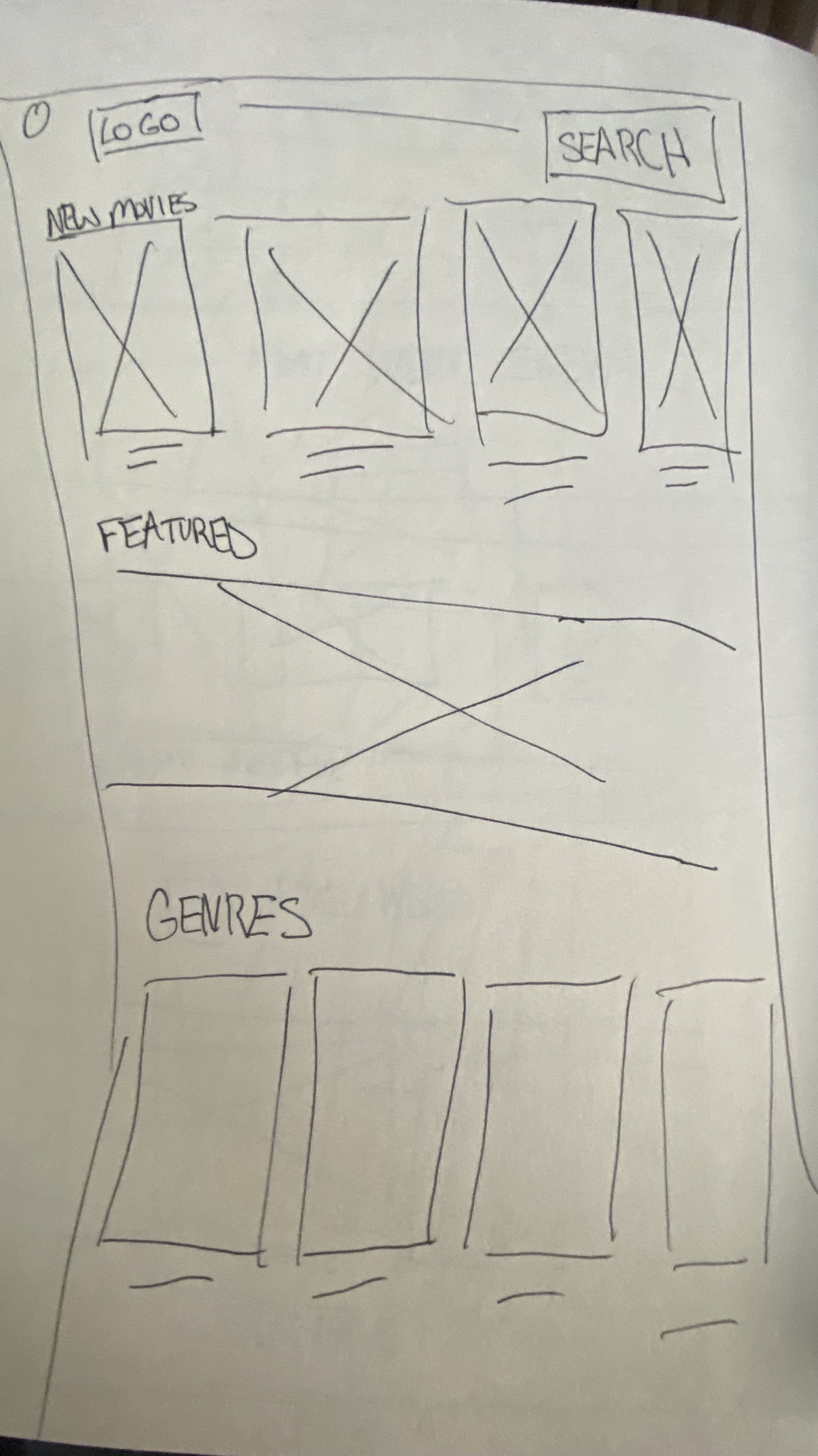

Paper wireframe screen variations
Of course a lot of users prefer purchasing movie tickets on mobile, so to make sure the site was fully responsive, I sketched out wireframes for different screen sizes (mobile wireframe, left) (tablet wireframe, right) while keeping in mind the same feel of the desktop site.

Digital Wireframes
Moving from paper to digital wireframes, I got a better understanding and visual feel of how the site would be laid out and how it can address users pain points in navigation and checkout process.
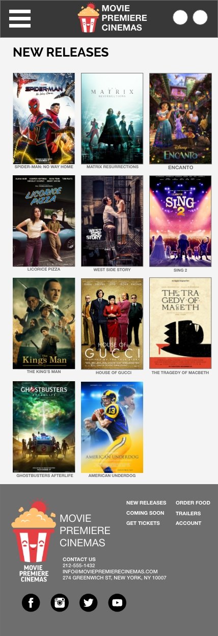
Having the homepage divided in sections made it easy for users to find any movie.
Digital wireframe screen size variations
I thought this design would easily be responsive on different screen sizes since the look and feel are so similar.


Low-fidelity prototype
To create a low-fidelity prototype, I connected all the screens involved in the primary user flow of the ticket ordering process.
At this point, I received feedback on my designs about certain functions, buttons and elements and made sure to incorporate the suggestions to address certain pain points.

Usability study: parameters
Study type:
Unmoderated usability study
Location:
United States, remote
Participants:
5 participants
Length:
20-30 minutes
Usability study: findings
These were the main finding uncovered by the usability study:
Movie Details
On the movie details screen, users wanted more options aside from choosing tickets like a list of the cast, synopsis and the option to view a trailer
Account
Users wanted easy access to the account page and nothing too comprehensive or overwhelming like what they’ve experienced with competitors
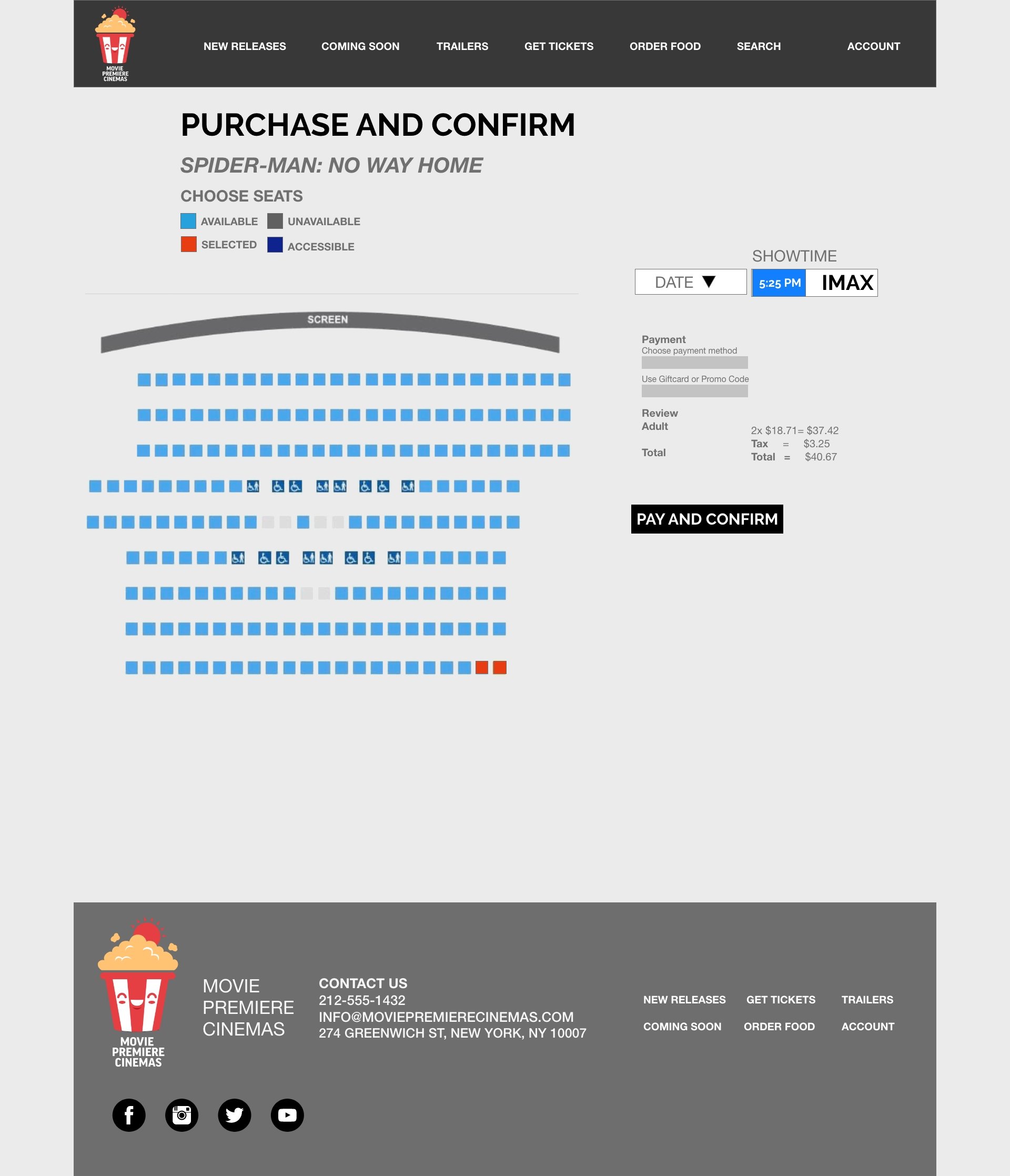
Checkout
On the checkout page, users wanted to see a confirm or view receipt button after adding in their card number and checking out instead of having it on the same screen
REFINING THE DESIGN
Mockups
High-fidelity prototype
Accessibility
Mockups
Users wanted a clear way to choose movie and date times. In the first mockup, the movie times were too small as mentioned by the users. I also added a dropdown for clear selection of the movie date.
Before usability study
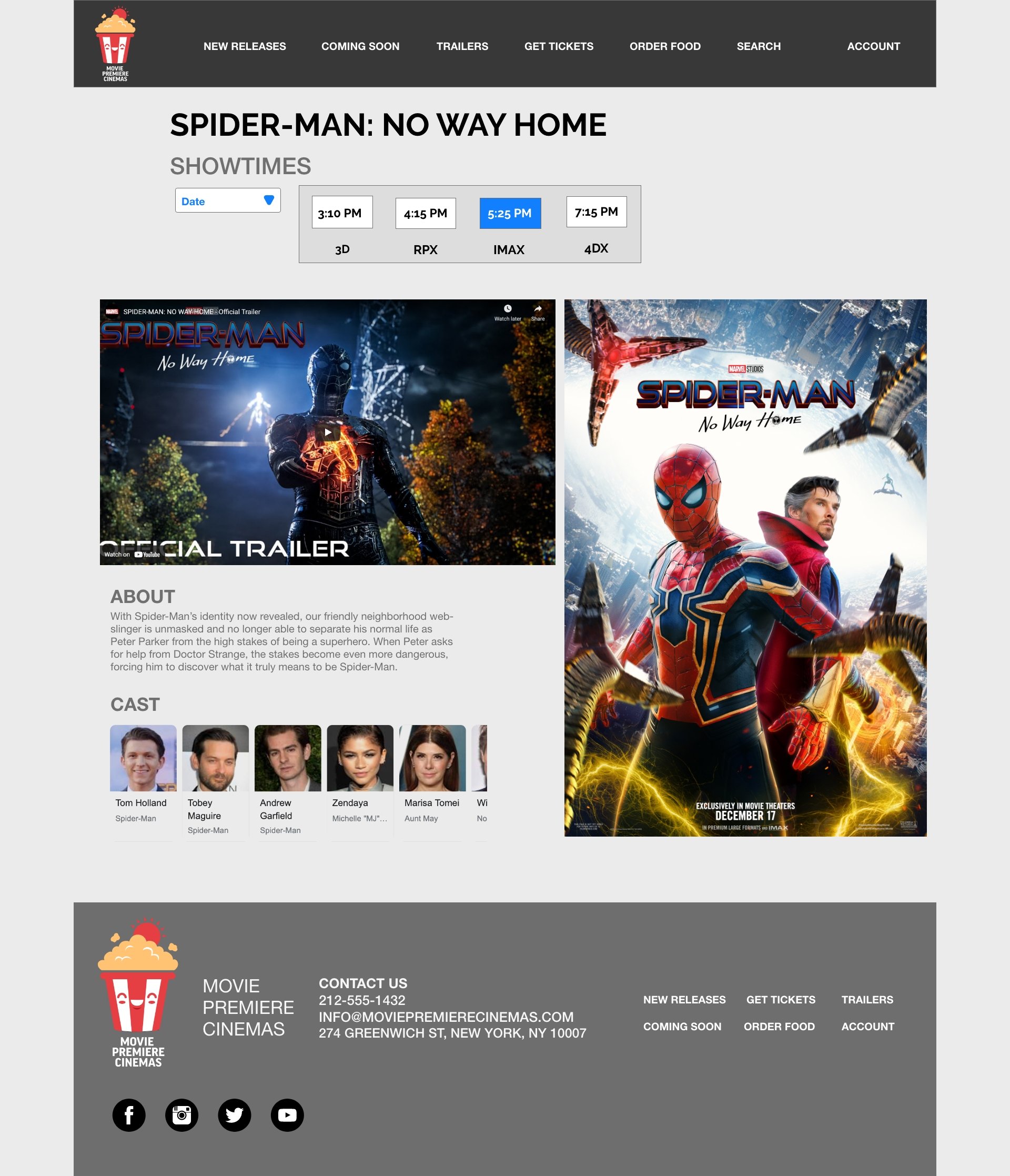
After usability study
For the alignment of the movies, I decided to stretch it across the screen so users can scroll horizontally through each section of the movies as they would on any screen size.
Home page before usability study
Home page after usability study
Mockups: Original screen size


Mockups: Screen size variations
I included designs for additional screen sizes in my mockups based on my earlier wireframes. Since a majority of users search and purchase movie tickets on a variety of screen sizes, I felt it was important that users have a smooth experience no matter what device they’re on.


High-fidelity prototype
My high-fidelity prototype follows the same user-flow as the low-fidelity prototype. It includes design edits and changes from the usability study plus feedback from other designers.
Accessibility considerations
I used color to highlight and complement what is already visible throughout the site instead of using it as the only visual means of conveying information
I also used different sized heading to distinguish visual hierarchy
I made certain there was a good amount of contrast between the content and typography and the background color
GOING FORWARD
Takeaways
Next steps
Takeaways
WHAT I LEARNED:
I learned that even if you think a certain aspect of your site doesn’t need to be improved upon, it’s important to listen to all feedback and take it into consideration. Even the smallest changes can have translate to big improvements to the user experience.
IMPACT:
Our users shared that the site was easy to navigate with clear visual hierarchy, detailed and engaging, and indicated that it has an easy checkout process throughout the site.
Next Steps
Ideate on new and creative features for the site.
Conduct follow-up usability testing on Movie Premiere Cinemas
Add and edit a few UI elements to the site to create a better user experience.
Let’s Connect!
Thank you for your time reviewing my work on the Movie Premiere Cinemas website! If you’d like to see more, view my work and case studies here, or to get in touch, visit the contact page or my LinkedIn!