
PENNY PINCHER
APP AND RESPONSIVE WEBSITE CASE STUDY

Project Overview
The product:
Penny Pincher is a finance app and website focused to help tutor young adults in budgeting & saving money. What’s different between Penny Pincher and other finance apps is that you can use it without adding sensitive account info, linking accounts.
Project duration:
January 2022 to February 2022
The goal:
Design an app that will help young adults in budgeting their expenses and help them be financially independent.
The problem:
Now more than ever, students and young adults need to find ways to budget and save money. Penny Pincher is aware that some young adults lack the general awareness and knowledge of budgeting and saving money.
My role:
UX designer leading the app and responsive website from conception to delivery.
Responsibilities:
Conducting interviews, paper and digital wireframing, low and high-fidelity prototyping, conducting usability studies, taking into account accessibility, iterating on designs, determining information architecture, and responsive design.
Understanding the user
User research
Personas
Problem statements
Competitive audit
Ideation
User research: summary
I used research I conducted based on competitive audits to develop interview questions, which were then used to conduct user interviews. Most interview participants reported that they have tried some budget and financing apps, but didn’t keep using them because the app was requesting too much information or the UX of the app was a bit confusing to navigate. The feedback received through research was that users would like to see a more user friendly flow of a budgeting app that gives them more control of what they want to enter from their accounts.
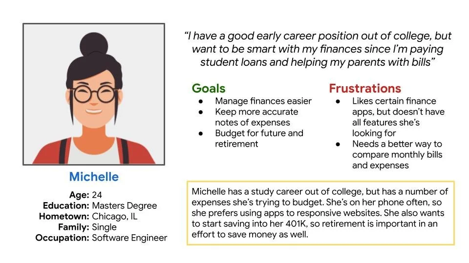
Persona 1: Michelle
Problem statement:
Michelle is a recent grad software engineer who needs to budget her expenses because she wants to keep track of her bills and finances.
Persona 2: Troy
Problem statement:
Troy is a law student who needs keep track of his expenses because being a student, he’s on a tight budget.

Ideation
I did an ideation exercise to come up with ideas for how to address gaps identified in the competitive audit. My focus was specifically on budgeting and account features.
STARTING THE DESIGN
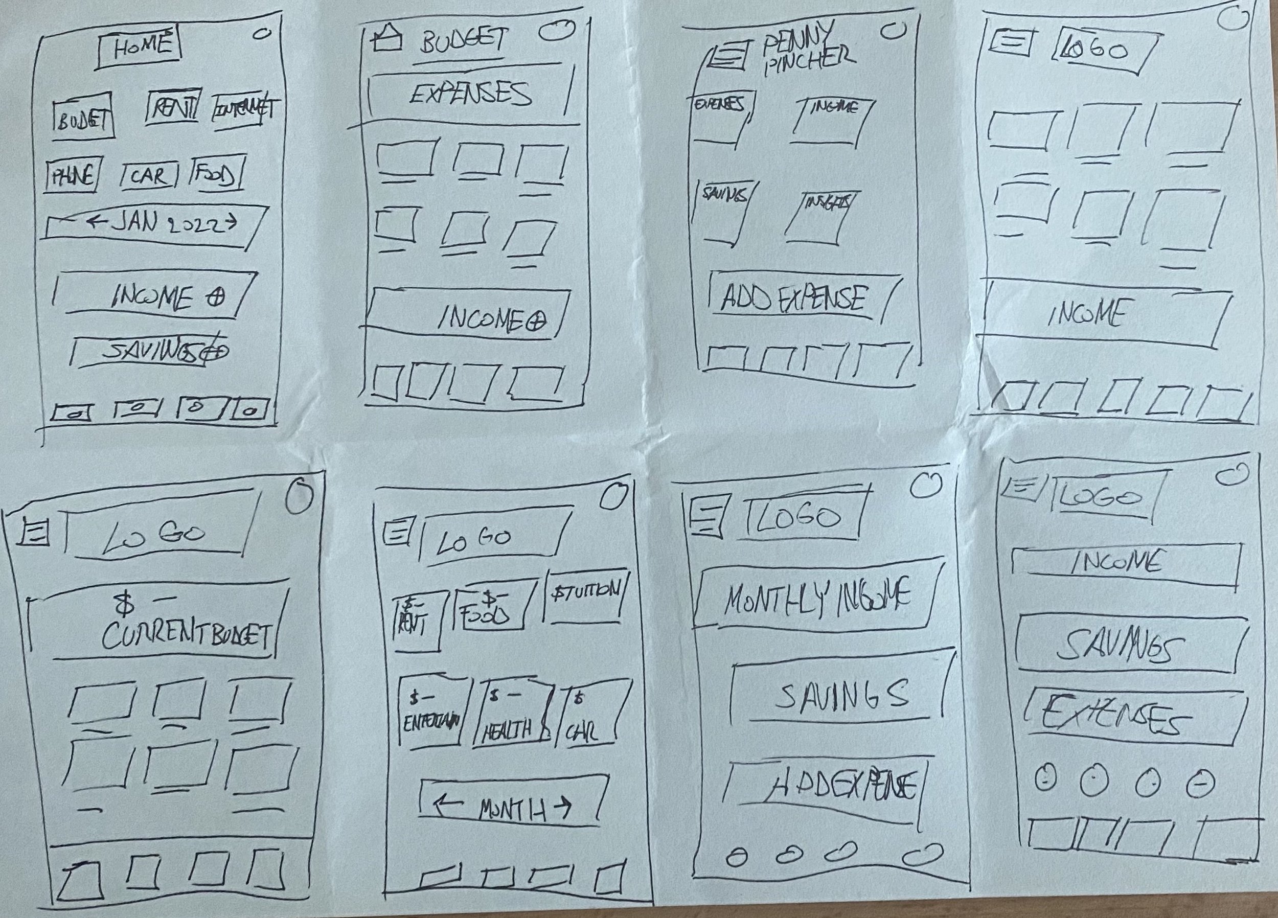
Digital wireframes
Low-fidelity prototype
Usability studies
Digital Wireframes
After ideating and drafting some paper wireframes, I created the initial designs for the Penny Pincher app. These designs focused on delivering personalized guidance to users to help add certain transactions from their account to the app.
Select category from expenses for more detailed sorting (top left)
Global navigation to access all features within the app (bottom)
Low-fidelity prototype
To prepare for usability testing, I created a low-fidelity prototype that connected the user flow of adding a transaction to a user’s account.
Usability study: parameters
Location:
United States, remote
Study type:
Unmoderated usability study
Length:
30-45 minutes
Participants:
5 participants
Usability study: findings
From the findings of the usability study, I learned there would be a bigger focus on account management, more in-depth information on tools and updating the transaction/upload screen.
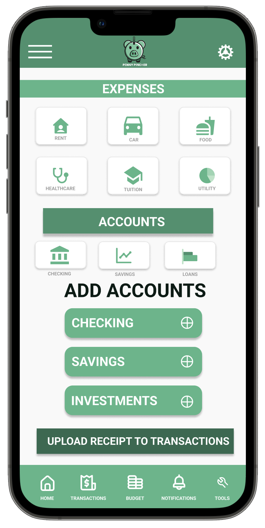
Accounts
Users want the ability to add their accounts for automatic adding of their transactions
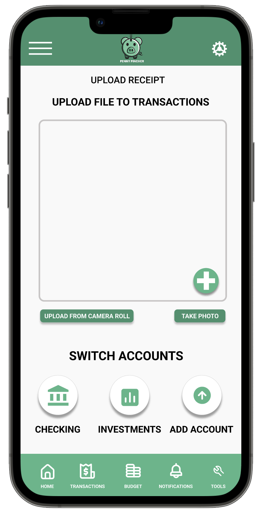
Upload Receipt or Transactions
Users weren’t certain if uploading receipts would be the most convenient way to add transactions
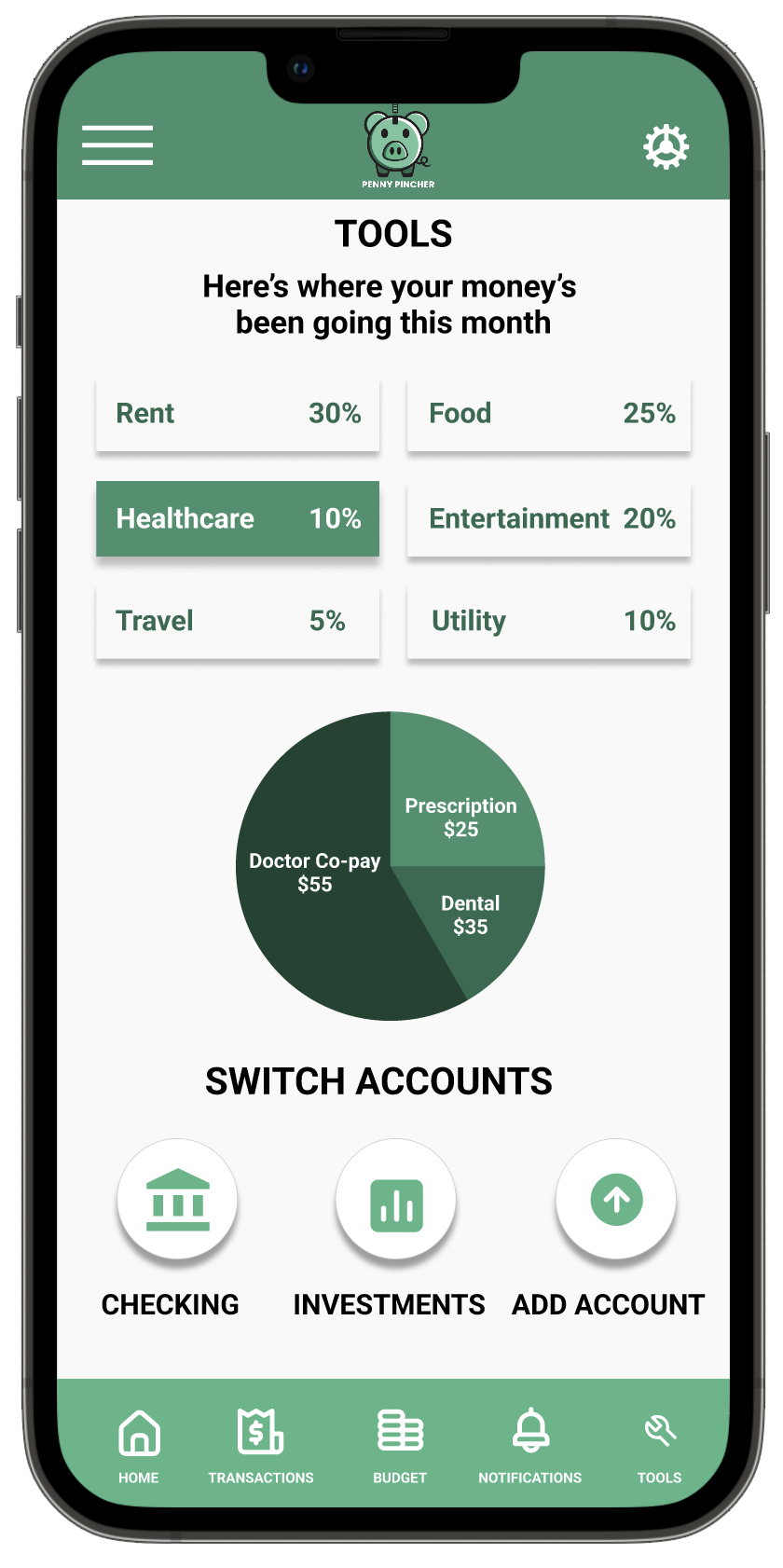
Tools
Users liked seeing a breakdown of their different expenses
Refining the design
Mockups
High-fidelity prototype
Accessibility
Mockups
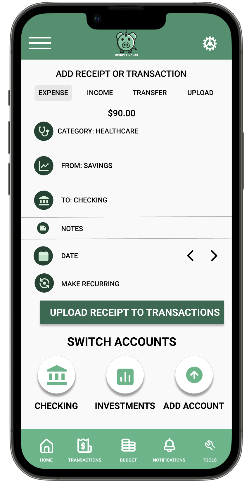
Based on the insights from the usability studies, I applied design changes including providing a clear section of the ‘Add Transactions’ screen to add notes plus icons for each section for users that may need to differentiate for accessibility purposes.
Before usability study
After usability study
Additional design changes included adding an option to view a more detailed breakdown of expenses when the user taps on a specific section of expenses to the Tools screen.
Before usability study
After usability study

High-fidelity prototype
The high-fidelity prototype followed the same user flow as the low-fidelity prototype, including design changes made after the usability study.
Accessibility considerations
1.
Clear labels for interactive elements that can be read by screen readers.
2.
Icons where any key expense is added in throughout the app
3.
Color palette of range of green added in taking into account users who may have accessibility needs
Responsive Design
Information architecture
Responsive design
Sitemap
With the app designs completed, I started work on designing the responsive website. I used the Penny Pincher sitemap to guide the organizational structure of each screen’s design to ensure a cohesive and consistent experience across devices.

Responsive designs
The designs for screen size variation included mobile, tablet, and desktop. I optimized the designs to fit specific user needs of each type of device and screen size.
Mobile Website Screen size
Tablet Website Screen Size
Desktop Website Screen size
Going forward
Takeaways
Next steps